
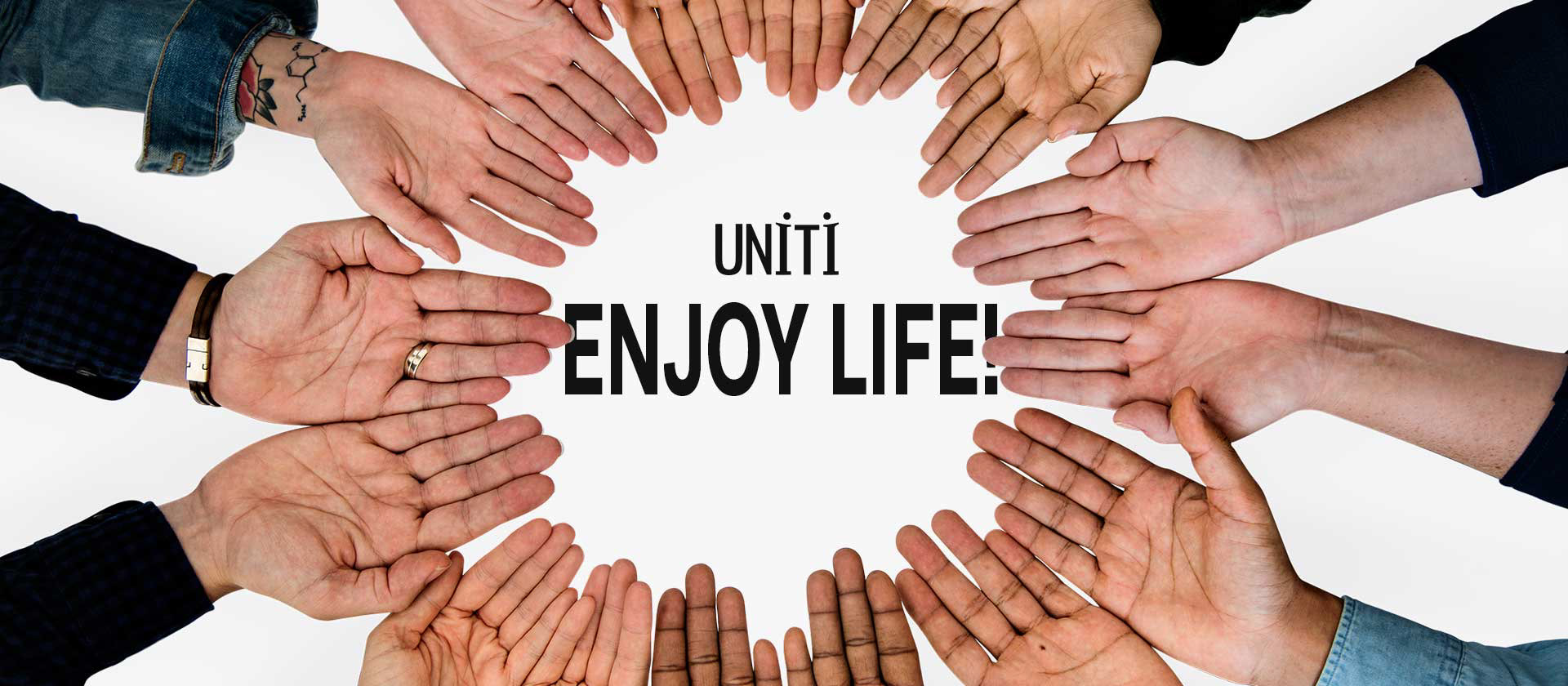
When Uniti CEO Loredana reached out to me for a brand identity, and told me their mission statement is “Enjoy Life” I knew it was going to be a pleasure to work with them on the project. I was right! I sat down with designer Nick Atchesin (animator and CEO of NE Productions) and asked him about his creative process with the logo. To bring excitement, not only did he symbolize two people with arms outstretched in the “I’s” of the word Uniti, he choose yellow as the accent color for the company.
COLORS
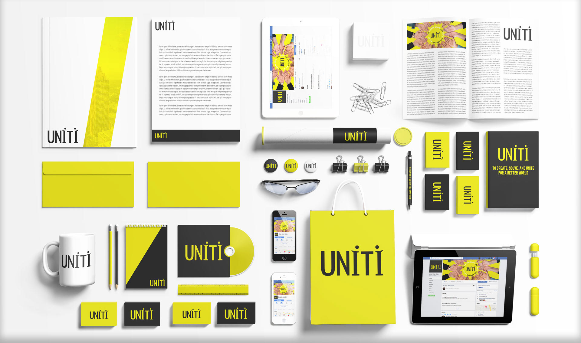
We agreed whole heartily that yellow was a perfect color to represent the fun and unique purpose for this start-up. First decision we made with the colors was tone down the yellow slightly, then we added a touch of white to the black they were using. This was to to make the contrast between the black and yellow easier on the eyes.


ICONOGRAPHY
With Uniti’s icons we wanted to continue the excitement. We tried many different creative directions to symbolize fun in their icons. To stay true to their brand we decided to use the “I” as a symbol for people.